


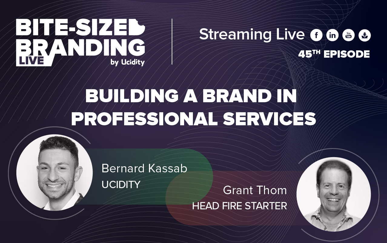
Content Marketing | 3 min read
We are impressed with how they do rebranding these days, and the new ways experts make them are way different from the traditional methods. To understand and better understand how big brands are rebranded, we are joined by Chris Harris from Red Kite and the Lead Designer at Udicity, Vincent Leonaldo.
We will give our opinions on how these rebrandings are, giving out both positive and negative views.
Meta
The first brand we are giving our opinions to would be Meta. Meta is what holds and hosts all of Facebook's micro brands. Chris and Vincent do not like how a super cutting-edge brand is represented. Achieving a minimal and streamlined design could have been their intention, but they did not execute it very well.
There is no synergy between the text, which is blocky and angular and does not complement the rounded and free-formed shaped logo. The design of the logo is also not current, as multiple brands have commonly used this over the years. Grant believes there is more to this since they are touching on iconography, four letters, bold, and symbolism, which shows they are reading the market correctly but are not yet completed.
Red Rooster
The vote with Red Rooster is somehow split but leaning more on approval. The total look of the logo is "cute", but it does not literally convey that it is a fast food company. The old logo is a bit dated though it can bring a little bit of nostalgia. The new logo provides more versatility and modernity.
Kia
The new logo has a tremendous dynamic shape and italics that feel like momentum progression. Something that says speed and fast cars gives a feel that it is a premium vehicle. It is also unique compared to other logos with circles or anything bordering it. It elevated the company to a new level.
Ampol
The angle of A in the new logo provides a nice throwback, but the wideness of M and O throws away the slickness of the new design. The totality of the sign shows a bit of emptiness. Simplicity is definitely expressed, but there is nothing much going on with it.
Uber
The public may not react well to this rebranding, but its application makes it great, way beyond the logo. The new frames give an excellent brand identity system they use in their marketing. It provides a nice, simple, modern look, especially with the contemporary black-and-white colour palette.
slack
The rebranding of slack has a modern and versatile look, especially with the application, but the older version is more feasible for the eye. The new one is more playful, flexible and relevant. They managed to pull their brand away from the look similar to a hashtag.
Zip
The new design grows on you. It does not have a modern feel but more of the 80s look, but as you look at it and use the application together with the languaging makes it interesting. The colours are not very common on the net, making it a good choice.
Glasshouse
The rebranding's use of the candle and its product s a good step. It looks sophisticated and clean, which fits the elegant market the brand is aiming for. The symbol they used shows more versatility, and it looks modern.
Hotjar
The rebranding of the logo and the application is a different offering. The software has excellent artwork and design that is modern and consistent. The gradient and the colours are very well chosen.
Assembling the components should always be considered by branders and designers and not just the appearance. It would be best to look at how it will transition before becoming a brand. Check on the fonts, colours, frames and everything else thrown in on the design before presenting it to the public to ensure you have a fitting representation of your brand.
Published on November 18, 2022

-3.jpg)